
Advertisement feature in association with Fine Art America
When I bought a house for the first time three years ago I thought that was it, at last, I’d be able to paint the walls whatever colour I wanted without worrying about what the landlord would say when they realised. Fast forward to last month and I’d managed a teal chimney breast and one feature wall in the bedroom.
I didn’t know what was the matter with me.
In pretty much every rented house I’ve ever lived I’ve completely ignored restrictions on decorating and painted every room in elaborate combinations of pink and yellow, red and gold, teal and chocolate brown. (I just had a trawl back through Facebook to find you a picture of the kitchen where I painted bright pink and yellow on opposite walls, and draped the windows with turquoise sari fabric, but I look too drunk in all of them to be honest. I had some good parties in that kitchen.)
Perhaps it’s just that I don’t like being told that I can’t do or have something, and like to prove otherwise, and the minute I was actually allowed to paint, I wasn’t that bothered anymore?
It’s not a terribly flattering insight – it makes me sound a bit immature and possibly like I have some issues with authority – but it’s probably true.
This month though I got over myself. For ages I’ve been toying with painting the hallway, stairs and landing a lovely coral pink colour, and now I’ve finally done it!
I also may have got a bit carried away with the idea and repainted Belle’s bedroom AND painted my spare room a gorgeous dark green colour, basically turning it into a teeny tiny working men’s club. Go and have a look at my Instagram story highlights under ‘workspace’ to see it in all it’s glory.
Back to the hall though.
The final push came when a company called Fine Art America asked me if I would like to have a browse of their wall art collection and pick out some new prints for my walls.
I had the suggested browse and said that yes please, I would like to pick out some new prints. I wasn’t sure how I would choose exactly, as they had so many, and would I want regular prints or something fancy like tapestries?
I didn’t know, but I wanted in.

Having pictures up on the walls is one of the key things for me that makes a house feel like a home – it brings colour and interest and the art you choose gives a little flash of yourself to other people.
But then I remembered that all of my walls are FULL and so where would I put them? Where I really wanted to put them was on the wall just inside the front door, but I had two very large posters there already, strategically covering up some large blutac marks from when I first moved in and decided to stick an inspirational yearly calendar of challenges to the wall.
I know, I don’t know what I was thinking, it’s like I’m 42 on the outside and 14 on the inside.
Anyway, I couldn’t change the pictures without doing something about the blutac marks and I couldn’t really do anything about the blutac marks other than paint the entire hallway, stairs and landing, and so here I am, now living in a house with a LOT of pink.
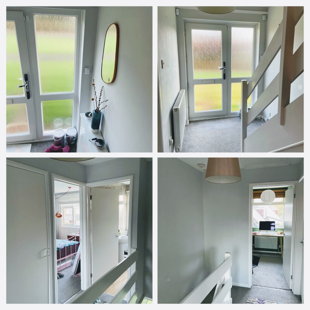
Just to give you a bit of context, here are a few before pictures. As you can see, it was BORING!
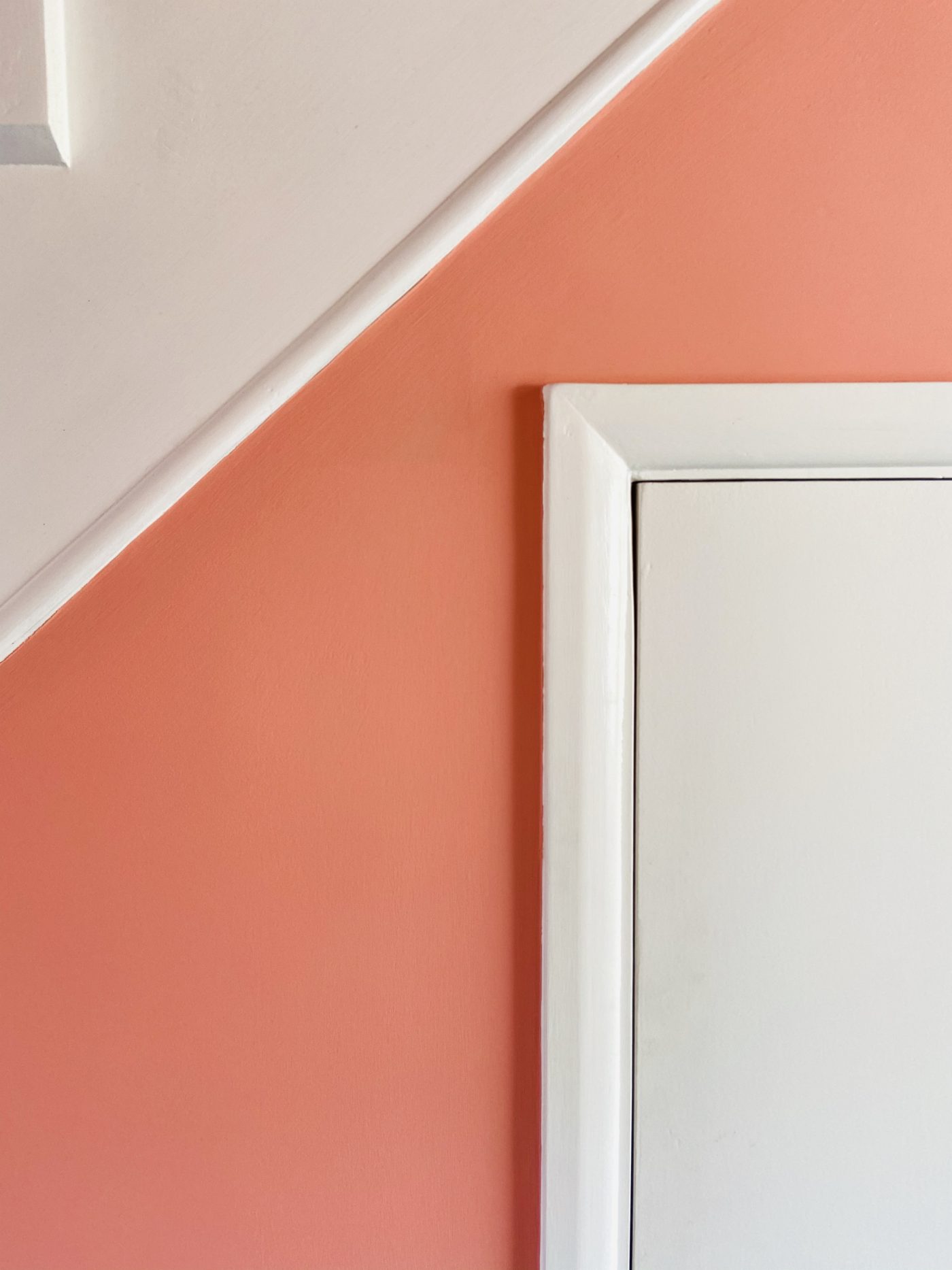
Now though, now it is a thing of beauty! A pink palace that positively glows! As in actually glows at night from the outside through the glass door. A bit like a classy brothel.
(A man did once knock on my door at about 1am thinking I was a brothel, which was one of the more confusing ten minutes of my life, but that’s a story for another time.)
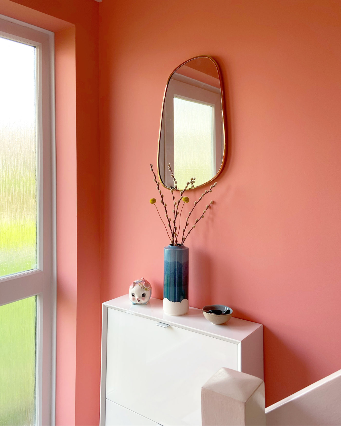
I say ‘pink palace’, but there was some debate on Facebook and Instagram as to whether it was actually pink or orange. I think actually that’s the beauty of the coral pink colour I chose – first thing in the morning in natural light it’s most definitely pink, in my eyes at least, but as the day goes on and the light changes it changes – the orange tones come out, especially in artificial light, and it’s really quite glorious. My camera seems to pick up the orange more than the pink sometimes too, which is very confusing.
For a while I hoped I might go viral with one of those ‘is this dress blue or gold?’ type posts, but alas, it seems people aren’t really THAT fussed after all.
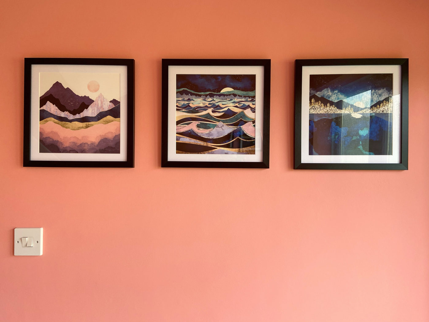
To complete the look then I just needed to pick my wall art from Fine Art America, but what to go for? Posters? Framed prints? And how to choose?
I really like that they have some collections already curated, in case you need inspiration, and I do love the glamour of the Slim Aarons photographs. His personal mission apparently was ‘to photograph beautiful people doing beautiful things’ and they really are stunning photos. (This picture is how I imagine myself to look every morning.)
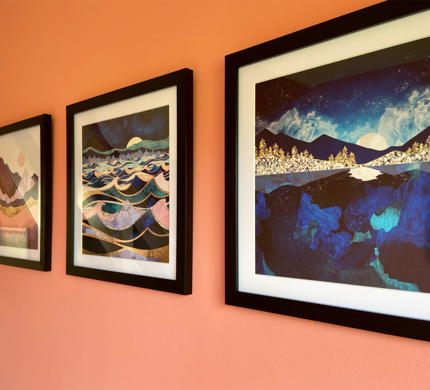
Colour wise they didn’t really fit the pink/orange vibe though, so in the end I picked out a set of three art prints that were a little more pink and a little less 1970s pool party.
Tada!
What do you think?
I think this one is my favourite as it picks out the coral colour of the walls so well. Not bad given that I got the prints before I chose the paint and didn’t buy any testers at all. And my mum says I don’t know how to even get dressed in matching colours! Pah!
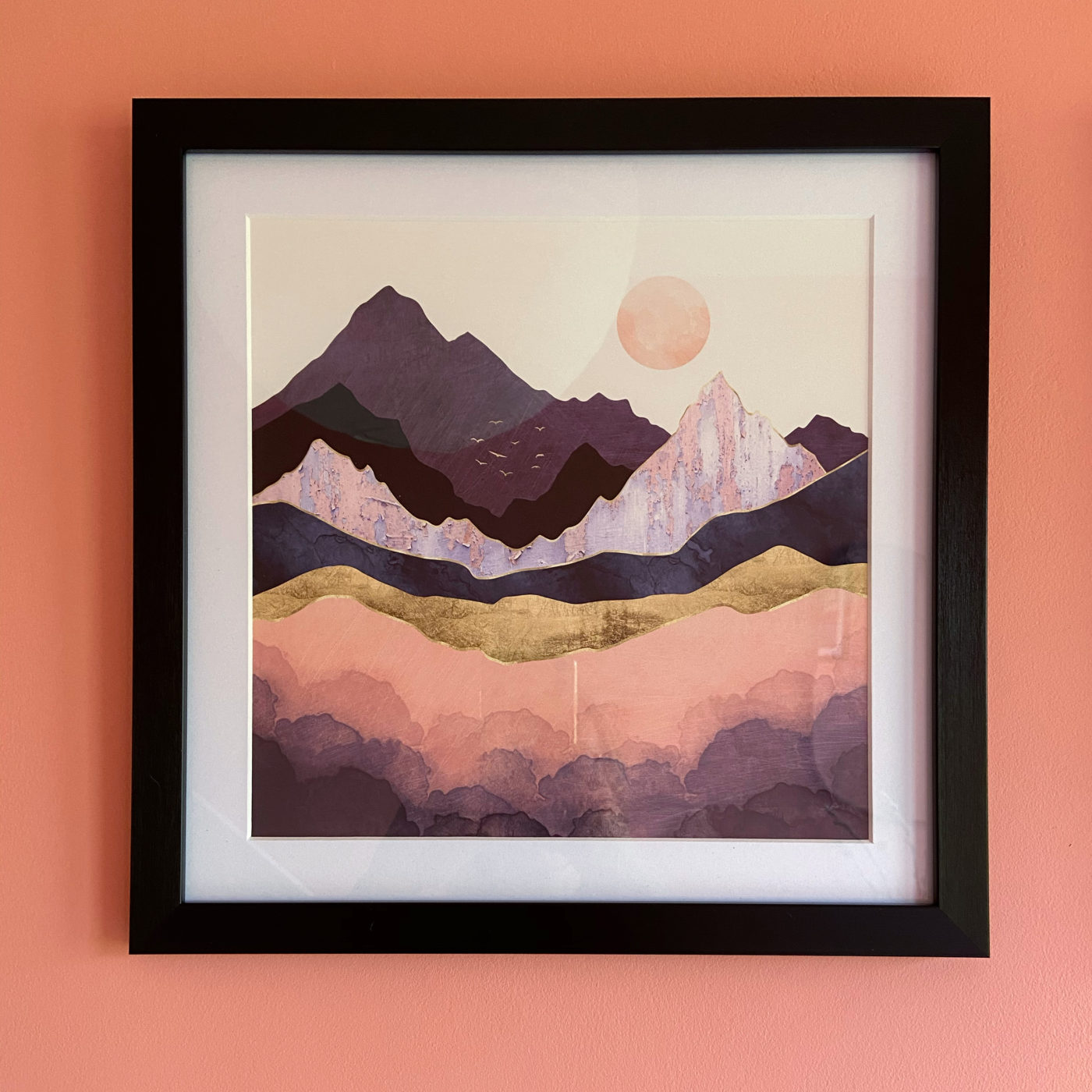
My prints arrived very nicely wrapped in a sturdy cardboard tube and the quality of the paper and the printing is excellent. I was really pleased with them and think they are the perfect finishing touch to my jazzy new hall.
And finally… you’ve seen the photos now, help settle the debate. Is my hallway pink or orange?
Just to step in on the pink / orange debate – that picture from the Instagram post with you reflected in the mirror – the reflection shows how much the colour changes – and the last photo of this post – it looks more orange at the top and more coral underneath – just like you’ve managed to create an ombré effect / look!
Author
HOURS that took Christine, painting more orange at the top of the walls… You’re right though, even within one photo the colour changes!!
HI! I’ve just come across your blog and have loved reading it, and love your decorating. I’m about to go a bit mad and paint a room some version of pink. I love the idea that the colour in your hallway changes with the light – could you tell me which paint you used?
Author
Hi Luke! Thanks for reading :-) I would like to tell you the exact shade but honestly I can’t remember… that’s not very helpful is it?? To be honest though it’s one of the those colours that looks so different in different lights and parts of the house. It was from B&Q from the Valspar ones that they mix for you. I use those paints a lot as they go on really well and are good value.
Well it has been a couple of years! I can’t remember what I had for lunch. I’ll wing it and hope for the best. Cheers!