Advertisement feature
When I bought my house nearly three years ago, one of the first things I wanted to do was to buy some wallpaper. I think it was that having always lived in rented houses, I’d never had the opportunity to put up wallpaper before, and it felt like the kind of thing that would mark my territory.
My house was built in the early 1970s and I love 1970s style so I ended up buying three rolls of this wallpaper from a site aptly named ‘Wallpaper from the 70s’.
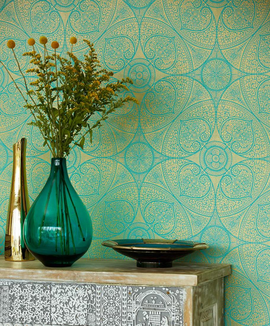
I wish I could say that this is my house but I have to confess that nearly three years later, the three rolls are still in my understairs cupboard. I absolutely love the design, but I just can’t commit to where I want to put it. One day though, one day I’m going to be inspired and it’s going to be glorious.
It struck me actually, when I was shopping for wallpaper samples from bed the other morning, (remember I’m an interior designer now?), how drawn I am to really bold, bright designs. I scrolled quickly past all the delicate motifs in pale colours – the ones that stood out for me were dark or contrasting colours and elaborate patterns. In my mind, if you’re going to go to the effort to hang wallpaper, you might as well go for it hadn’t you? If you find yourself erring towards pale or delicate patterns then honestly, what’s the point? Just slap some paint on and stop worrying about it.
Given that we could all do with a bit of cheering up at the moment and in the hope of nudging myself closer to hanging my own rolls of turquoise and gold loveliness, I thought I’d have a browse on their website and pick out a few of my favourite happy blue wallpapers. Blue generally has a reputation for being a very calm and soothing colour, a bit boring maybe, but given the right shade and pattern I think it can bring a lot of happiness to a room.
Here are my top picks:
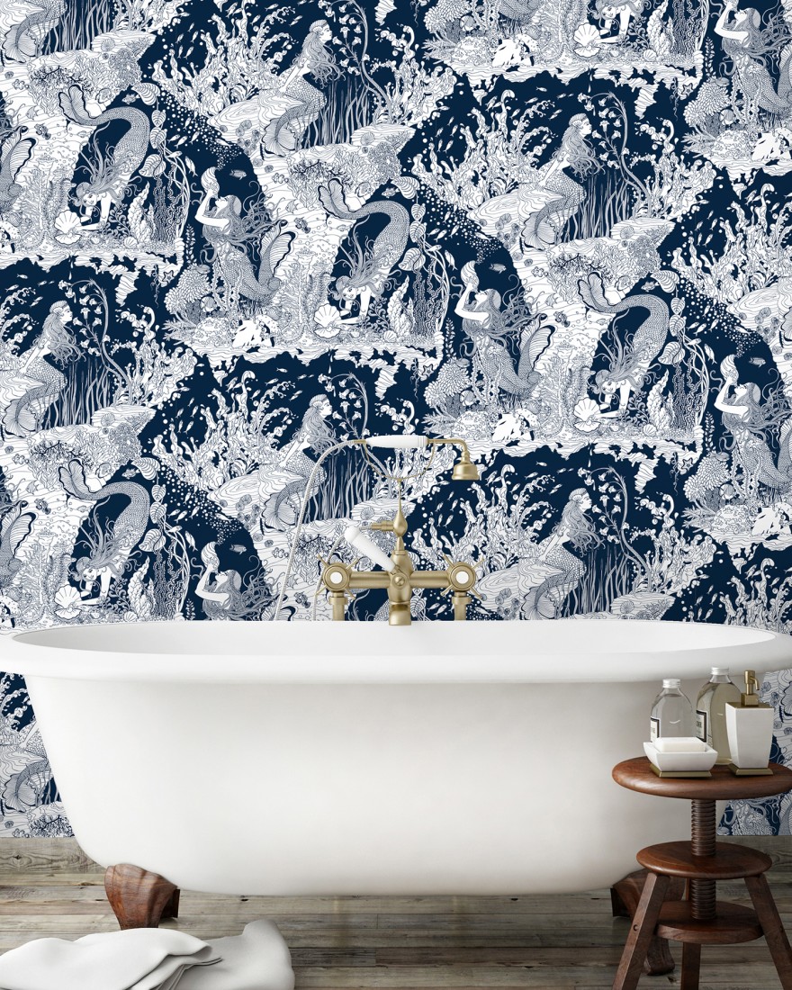
Mermaid wallpaper in the bathroom
Oh my goodness, how lush is this mermaid wallpaper? I absolutely love it. I’m imagining it paired with some white scalloped tiles that look like fish scales, and perhaps some big fluffy towels in a chic, mustard yellow? I’d recline in the bath with a French martini and live my best mermaid life.
This one is from Brighton based wallpaper manufacturer Dupenny and I’d definitely recommend checking out their whole range – they have some really fun wallpaper designs based on 1950s fashion and Wallpaper from the 70s has it at a really good price.
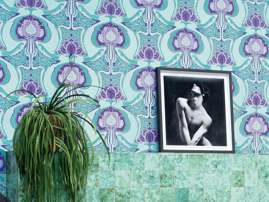
Art nouveau in the downstairs toilet
When I look at this wallpaper I picture myself sat in a smokey Parisian cafe at around the turn of the 20th century. I probably have a cigarette in a long holder, because smoking was cool then, and I have a look in my eyes as I sip my strong coffee that says I’ve lived an exciting but dangerous life. (This could also be influenced by the fact that I’m listening to a ‘French classics’ playlist on Spotify as I write this.)
It’s a bold pattern, so I’m picturing it making a statement in a downstairs toilet. I really like the dark blue version of this one too. The tile match in this image is delicious.
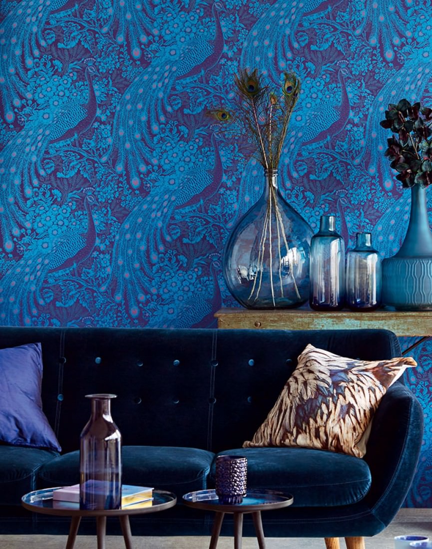
Peacock study fantasy
I had a BIG peacock phase about 10 years ago. I couldn’t get enough of it, I even redid my entire Christmas decoration collection to include peacock feather wreaths and tiny peacocks perched on snowy branches. It started getting a bit much when everyone jumped on it and bought me peacock themed everything for birthdays and Christmases, but I do still have a soft spot for the rich jewel tones, as seen in this gorgeous peacock wallpaper.
As it’s very dark I’m thinking this would work well in a a very grown up study or even a library? The kind of space I imagine gentlemen in the 1920s would retreat to with a brandy at the end of a long day of ignoring the children and bossing about the peasants.
Have I convinced you that blue doesn’t have to be boring?