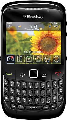
My very first smartphone was a Blackberry Curve. One of these cute little things, remember them?

I’ve never been very on top of the latest phone technology, so until I got this one, I think in 2009/10, I just had a phone that sent text messages and made calls – very retro. Being able to reply to emails FROM MY PHONE was a massive thing and the start of a flourishing if not slightly unhealthy obsession with being able to respond Very Quickly Indeed to everything. Just in case.
After this one, I went on to the Blackberry Bold. I have always been a big fan of the keyboard, always finding touch screens difficult to get to grips with. Ultimately though, the Blackberry just couldn’t keep up – the browser speed was painfully slow, the social media apps a little lacking and the range of apps generally was very limited. How could I be a social media goddess and not have Instagram?
A couple of years ago then I made the switch to android, and got myself an HTC, so when I was asked to trial the new Blackberry Z30 I was intrigued – would Blackberry have come on in leaps and bounds? Would they have caught up and turned themselves into a realistic proposition again?
The answer I found was yes. And no. I will also warn you in advance that this is not a techy review. I don’t know about processors and operating systems and things like that. This is about usability and how, as a normal non-techy person, I found using the Blackberry Z30. If you want more detail about features and specification then this review is very comprehensive.

Size matters
The first thing that struck me was just how big the Blackberry Z30 is. At five inches, it’s the largest Blackberry handset yet, and it shows, not just in size but in weight. My HTC is about the same dimensions – slightly smaller – but noticeably slimmer and lighter, leaving the Blackberry Z30 feeling like a bit of a brick in my hand to start with. Unfortunately it is also just a little bit too big for my hand (as the actress said to the bishop).
You know that natural position where your phone rests in your palm and your thumb reaches the buttons? I can’t quite do that comfortably with the Blackberry Z30. It’s partly a weight issue – when I stretch my thumb and tip the phone towards it, it falls out of my hand. I am pretty clumsy though so it could be that.
The basics
Aside from the size issues, the Blackberry Z30 looks pretty smart, reminding me of the latest HTC One. Unlike the old style Blackberrys it has a great size screen, the picture quality is good, and the sound even better. This was actually one of the things that struck me most; just how much better music sounded coming out of the Blackberry than from my HTC. I demonstrated the point to Belle at a train station, singing along to Wind Beneath My Wings. She did not look impressed.
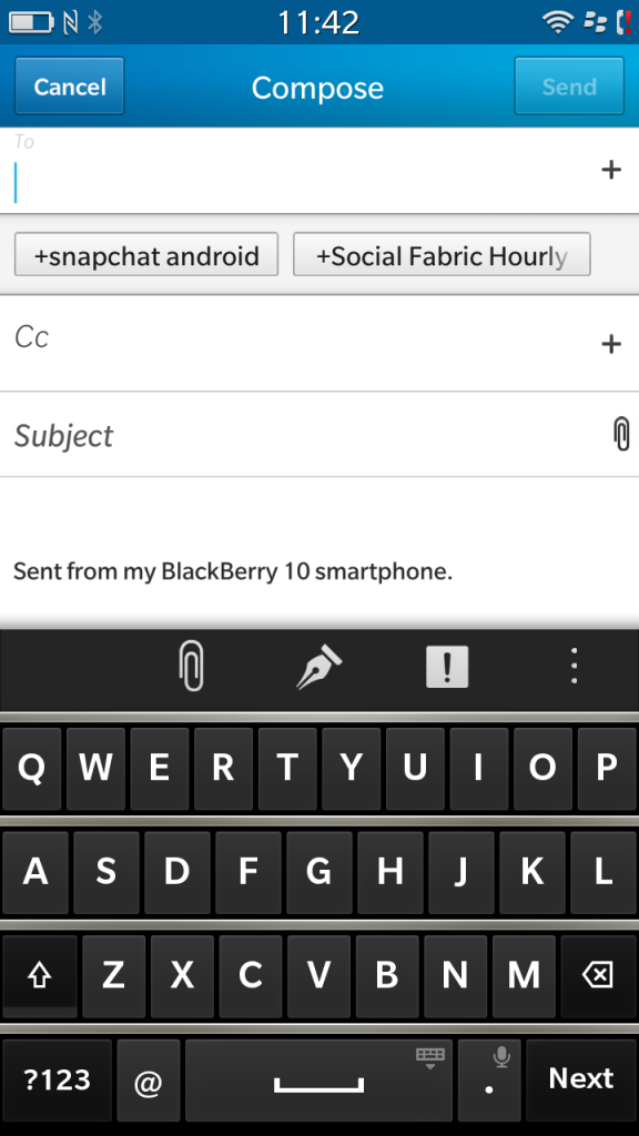
Another feature that’s different from the old style is the lack of a keyboard. I was worried about this at first as that was one of the key selling points for me, but weirdly it hasn’t been a problem. Despite being a touch screen for some reason the Blackberry Z30 keyboard is much easier to use than my regular touchscreen phone, and I had far fewer spelling mistakes and other annoying typing issues. I think the keys are a little wider, making it easier for my apparently uncoordinated fingers to navigate them.
As an interesting aside, when I took this screenshot (which you do by pressing the volume up and volume down buttons at the same time) my phone told me it that my ‘screen shot had been save in my personal space’, which I thought sounded a touch invasive.
The Blackberry hub
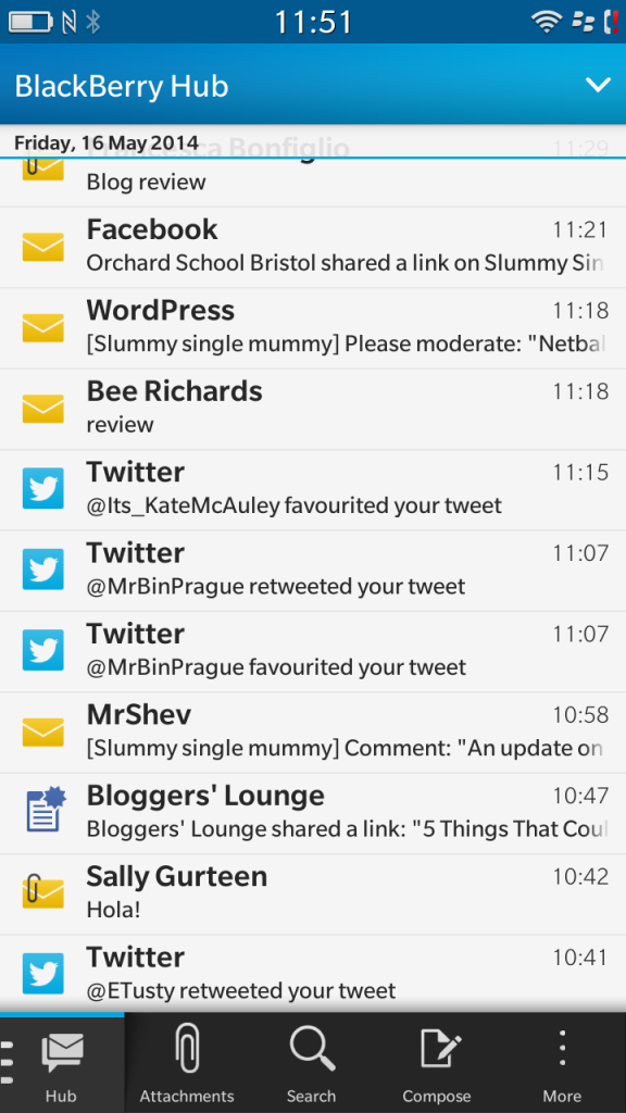
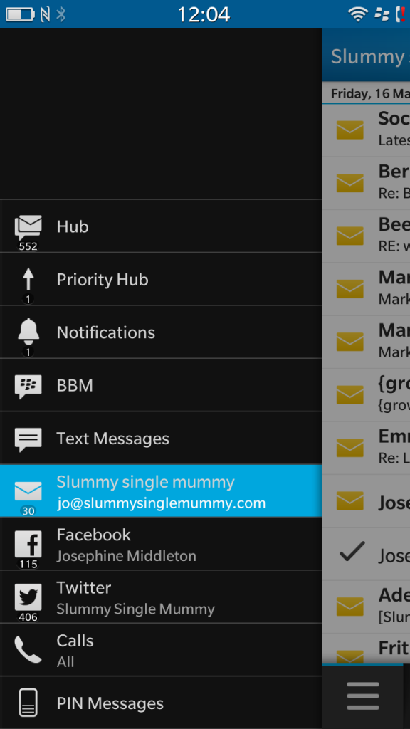
Here’s where it starts to get complicated. Or simpler, depending on how you look at it. I’m used to having my texts, emails and social media accounts in different places, accessible through icons or widgets that I can place wherever I want on the phone. This means that I can put all my favourite apps on my home screen. The Blackberry Z30 works differently though, bringing all of your different streams together in one place, like this:

I found that there were pros and cons to this. On the plus side it means you don’t have to visit lots of different places to get different information, but on the downside I did find it a little overwhelming – I get a lot of notifications across various channels and having them all pour into the same place made it a little difficult to concentrate! However, you do have the option to set up the hub so that only certain information comes into it, and within the hub you can pick individual streams to look at, so I think the issues I had were more just about me getting used to a new way of working.
I wasn’t keen on the home screen though, which simply shows the last four apps you’ve accessed. I appreciate that those four may well be the ones you use most often, but sometimes they’re not, and you have to faff about looking for what you need. I didn’t feel like Blackberry were making it easy for me to access my favourite things.
How intuitive is the Blackberry Z30?
I’m afraid to say not very.
When I first got an iPad, I didn’t have to think about it. I’ve never had a Mac or an iPhone and yet picking up the iPad and finding my way around was easy. Everything was where I expecting it to be and the gestures were simple. The Blackberry Z30 just didn’t have that for me. I would find myself looking at it, trying to do something simple like go back a screen, and having to think for a good couple of seconds before I could figure it out.
Faced with a list of my emails in the Hub for instance, I couldn’t figure out how to escape! There is no back button, no home button on the bottom of the phone, instead it’s all about the swiping. I often found myself swiping several times and feeling like a bit of a buffoon for not being able to make it do what I wanted it to and I don’t want to feel like my phone is working against me – I want us on the same team.
Summary
Although the Blackberry Z30 is a big step up from my adorable Blackberry Curve, it still feels lacking. The Hub is an interesting feature, that sets it apart from a lot of other smartphones, but ease of use let it down for me. The sound and picture quality is great, the browsing speed is better, but overall performance was a little slower than I’m used to. The range of apps available is still poor, meaning you do miss out of a lot of cool things.
Would I make the switch back from Android? Probably not. I’m over 35 now and have reached the ‘old dog new tricks’ phase, so I have lost the ability to work a new remote control, let alone a phone. I was impressed by the improvements that Blackberry have obviously made over the last few years but I fear that it may be too little too late.
Disclosure: I was sent the Blackberry Z30 to try out for the purposes of this review


